In the next three tables it is shown more in particular how the proportions of the various units act within the syllabic blocks.
Also in this case, the structure of the presentation tables resumes the structure of those seen at the "Politecnico di Torino".
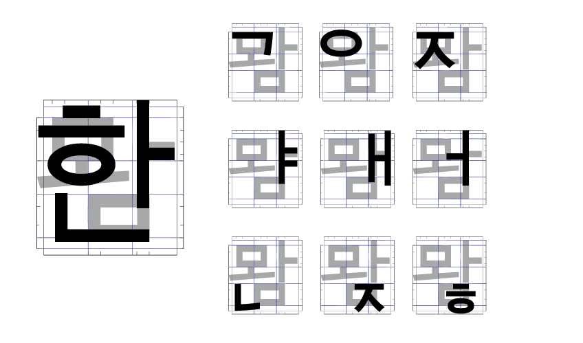
From the analysis of both: a Korean system font (non-monospaced) and the solutions studied by Olivetti, we succeeded in getting two different types of basic constructions: the first one consists of a grid three by three and the second it's a division of six blocks vertically by three horizontally.

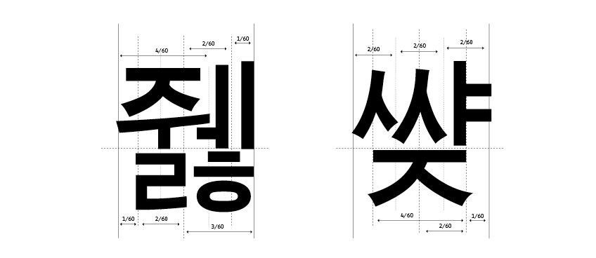
In this process of composition, the simplicity of the forms used, however, will not compromise the readability of the syllabic unit, even if it presents a quite complex construction.
Obviously this is just a preliminary study, but we hope to collect real mono-spaced solutions and find collaborators interested in developing the project in order to replicate the method used on Korean typewriters.
Here are some interesting links:
daemon-tools-lite-crack
ReplyDelete